Player performances in the IPL 2018 final
Following some good feedback and encouragement from my previous analysis on the league stage from IPL 2018, here’s another visualization from the IPL 2018 final. This shows how the players fared against each other.
Batting
In the below visualization, hovering over a player (might not work as well on mobiles) shows which bowlers he scored his runs against. The length of the arc is proportional to the number of runs.
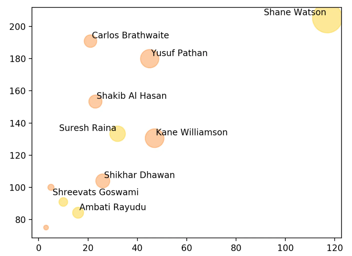
*Runs scored by each batsman - hover over a player to show just his stats*The image below shows which batsman had the most impact on the game by plotting a batsman’s runs (x-axis) against his strike rate (y-axis). Yusuf Pathan on the top right had a very good day for SRH. But then Shane Watson came in and dominated the game like nobody else and almost chased the total down single-handedly.
 Runs vs Strike rate for each batsman - circle size is proportional to runs scored
Bowling
This one makes it easy to see who conceded the most runs and also which batsman scored the most runs off a particular over.
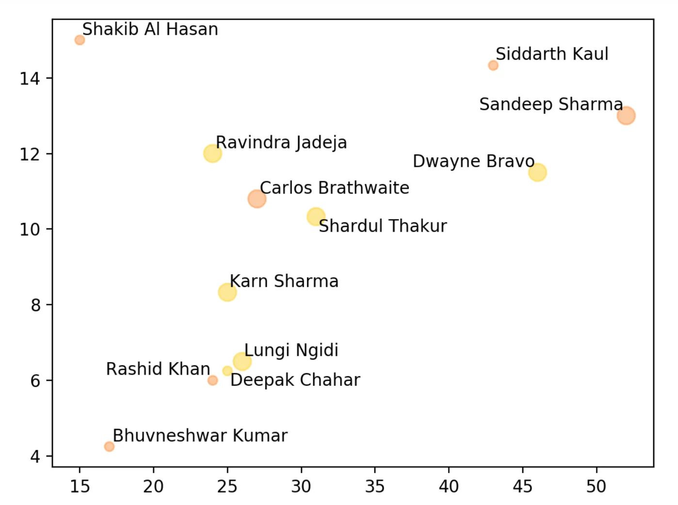
*Runs conceded by each bowler - hover over a player to show just his stats*The below image plots runs conceded (x-axis) by a bowler against his economy rate (y-axis). The smallest circles mean the bowler took no wickets with circles increasing in size with the number of wickets taken by the bowler. Dwayne Bravo had the worst day of all the CSK bowlers by some distance. But two SRH bowlers had worse days which mattered more at the end of the day.
 Runs conceded vs economy for each bowler - circle size is proportional to wickets
Scoring rate
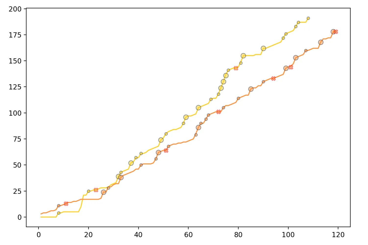
This image shows the traditional worm graph plotting the score of each team(y-axis) against the number of balls(x-axis). Small circles show fours and larger circles show sixes. The x marks are wickets.
Though SRH started off a tad slow, they consistently scored boundaries and posted a very good score in the final. CSK started off really slow in the first six overs but took off after that and never looked back.
 Scoring rate - circles are boundaries and crosses are wickets
While it is my intention to be accurate, the data could be slightly inaccurate. Here’s where I got the code for the visualization built using d3. I made some modifications and supplied my own data.